
You built the AI support stack. Tickets deflect. Macros auto-close. Hours are saved.
But if you can't show it — with numbers, with before-and-after comparisons, with dollars recovered per month — it feels like productivity theater. You're busy. Things seem better. But you have no proof.
Companies adopting AI and self-service effectively see 25-45% ticket deflection and ROI multipliers of 2× to 5× within the first year — but only when they measure it. The measurement is what makes the investment defensible: to a co-founder, to an investor, to yourself when deciding whether to renew the subscription stack.
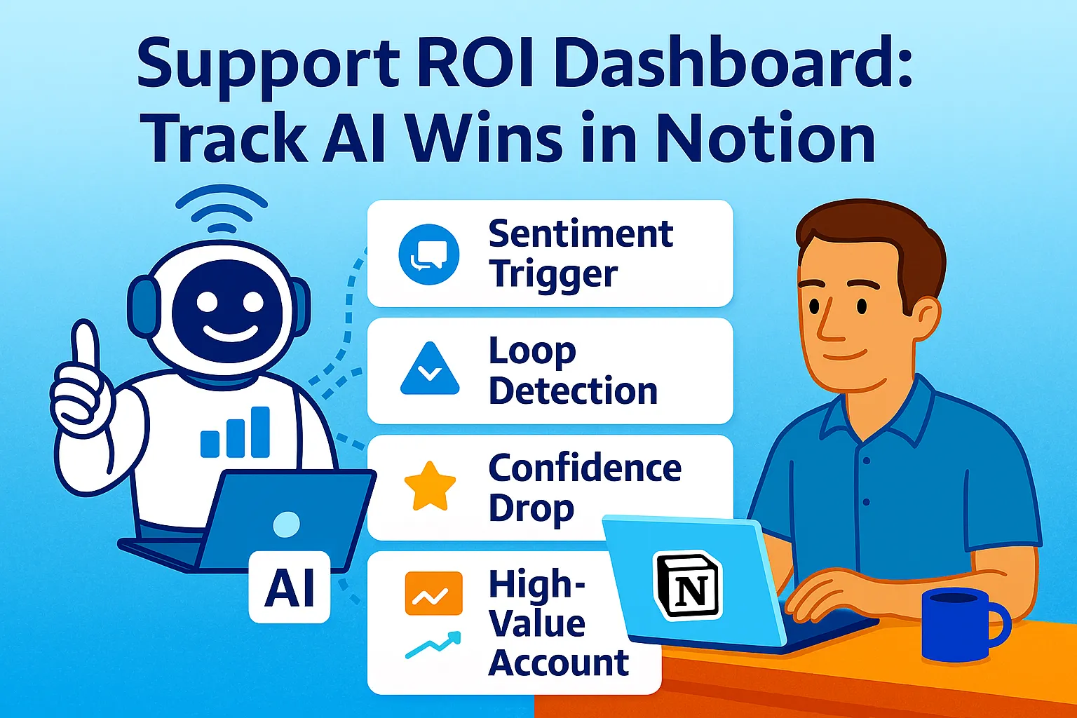
This article builds the measurement system: a Notion dashboard that tracks five core metrics (deflection rate, CSAT, hours saved, cost per ticket, escalation rate), captures pre-AI and post-AI state for every one, and visualizes ROI in a format that proves the $50/month AI stack is saving $400-800/month in operational cost.
The Five Metrics That Actually Matter
Most support dashboards track everything: tickets opened, tickets closed, tickets assigned, average response time by channel, ticket volume by day of week. Forty data points. Zero decisions.
The ROI dashboard tracks five metrics — the minimum set that answers one question: is AI support working, and what's it worth?
Metric 1: Deflection Rate Percentage of customer inquiries resolved by AI without creating a human-reviewed ticket. AI agents now deflect over 45% of incoming customer queries, with retail and travel companies seeing deflection rates above 50%. This is the primary ROI lever — every deflected ticket is a ticket you didn't spend time on.
Metric 2: CSAT (Customer Satisfaction Score) Percentage of customers rating their support experience as satisfied (4 or 5 stars out of 5). AI must maintain or improve CSAT — deflection that damages satisfaction isn't worth the time saved. Target: 85%+ overall, with AI-handled tickets matching or exceeding human-handled tickets.
Metric 3: Hours Saved Per Week Direct time recovered from deflection, macros, and automated triage. The metric that translates to your hourly rate × hours = dollars. Mid-market companies typically spend $12-18 per email interaction when fully loaded cost is calculated — solo founders' time is worth significantly more.
Metric 4: Cost Per Ticket Total support costs (tools + time) divided by total tickets handled. Should decline as deflection increases and automation handles more volume. Pre-AI: typically $15-25/ticket for solo founders. Post-AI: $5-10/ticket at steady state.
Metric 5: Escalation Rate Percentage of AI-handled conversations that escalate to human review. Target: 15-25%. Above 30% signals AI deflection quality issues (resolving but not satisfying). Below 10% may signal AI over-confidently handling tickets it shouldn't.
The Notion Dashboard Structure
One Notion page. Five sections. Updated weekly in under 10 minutes.
The dashboard page template:
📊 SUPPORT ROI DASHBOARD
Last updated: [Date]
Review cadence: Weekly (Monday morning)

━━━━━━━━━━━━━━━━━━━━━━━━━━━━━━━━━━━━━━━━
📈 QUICK VIEW: THIS MONTH
━━━━━━━━━━━━━━━━━━━━━━━━━━━━━━━━━━━━━━━━
Deflection Rate: [X]% (Target: 45%+)
CSAT: [X]% (Target: 85%+)
Hours Saved: [X] hrs/week
Cost Per Ticket: $[X] (Target: under $10)
Escalation Rate: [X]% (Target: 15-25%)

💰 ROI THIS MONTH:
Stack Cost: $[X]
Value Delivered: $[X]
Net ROI: $[X] ([X]% return)

━━━━━━━━━━━━━━━━━━━━━━━━━━━━━━━━━━━━━━━━
📊 METRICS DATABASE (linked view)
━━━━━━━━━━━━━━━━━━━━━━━━━━━━━━━━━━━━━━━━
[Embed: Weekly Metrics database,
 filtered to last 12 weeks]

━━━━━━━━━━━━━━━━━━━━━━━━━━━━━━━━━━━━━━━━
📉 PRE/POST COMPARISON
━━━━━━━━━━━━━━━━━━━━━━━━━━━━━━━━━━━━━━━━
[Table comparing baseline vs current state]

━━━━━━━━━━━━━━━━━━━━━━━━━━━━━━━━━━━━━━━━
💡 INSIGHTS & ACTIONS
━━━━━━━━━━━━━━━━━━━━━━━━━━━━━━━━━━━━━━━━
[Text block: what changed this week,
 what to improve next]

━━━━━━━━━━━━━━━━━━━━━━━━━━━━━━━━━━━━━━━━
📅 HISTORICAL TREND
━━━━━━━━━━━━━━━━━━━━━━━━━━━━━━━━━━━━━━━━
[Embed: Chart view of key metrics over time]
Building the Weekly Metrics Database
The metrics database captures one row per week. Each row contains the five core metrics plus calculations.
Database properties:
Property | Type | Formula/Value |
|---|---|---|
Week Of | Date | Monday of the week |
Total Tickets | Number | From helpdesk |
AI Deflected | Number | From chatbot or helpdesk tag |
Human Handled | Number | Total - Deflected |
Deflection Rate % | Formula |
|
CSAT Responses | Number | Survey responses received |
CSAT 4-5 Stars | Number | Satisfied responses |
CSAT % | Formula |
|
Avg Time Per Ticket (min) | Number | Your estimate |
Hours Saved This Week | Formula |
|
Stack Cost (weekly) | Number | Monthly cost ÷ 4.3 |
Cost Per Ticket | Formula |
|
Escalations from AI | Number | From helpdesk escalation tag |
Escalation Rate % | Formula |
|
The weekly data entry (10 minutes, Monday):
STEP 1: Pull numbers from helpdesk
  Total tickets this week: [from Help Scout / Freshdesk report]
  Tagged "AI-resolved" or "Bot-resolved": [count]
  Tagged "Escalated": [count]

STEP 2: Pull CSAT data
  Total responses: [from CSAT survey tool]
  4-5 star ratings: [count]

STEP 3: Estimate time
  Average time you spent per
  human-handled ticket: [X] minutes
  (Review 5-10 tickets, average the time)

STEP 4: Enter into database
  Create new row for "Week of [Monday date]"
  Fill in all number fields
  Formulas calculate automatically
The Pre/Post Comparison Table
The comparison table lives directly on the dashboard page — not in a database, just a simple table comparing two states.
Comparison table structure:
Metric | Pre-AI Baseline | Current (Last 4 Weeks Avg) | Change | Value Created |
|---|---|---|---|---|
Tickets/Week | [X] | [X] | [+/-X] | - |
Deflection Rate | 0% | [X]% | +[X]% | - |
Hours/Week on Support | [X] | [X] | -[X] hrs | $[X × hourly rate] saved/week |
Cost Per Ticket | $[X] | $[X] | -$[X] | - |
CSAT Score | [X]% | [X]% | +/-[X]% | - |
Monthly Stack Cost | $0 | $[X] | +$[X] | - |
Monthly Value Delivered | - | $[X] | - | Net: $[X] |
Calculating "Pre-AI Baseline" (one-time, before implementing AI):
Before you build any AI support automation,
document these baseline numbers:

Week 1-4 of manual support (no AI, no macros):
  Total tickets per week: [average]
  Hours spent on support per week: [track precisely]
  Average time per ticket: [hours ÷ tickets]
  CSAT score (if tracked): [X]%
  Cost per ticket:
    [hours × your hourly rate] ÷ tickets

Store these permanently as your baseline.
Every comparison on the dashboard
references these numbers.
If you're already using AI support and never captured a baseline: estimate conservatively. Assume 0% deflection, 20-30% longer time per ticket, slightly lower CSAT.
The ROI Calculation Engine
The dashboard must answer: what is this AI stack worth, in dollars, per month?
The monthly ROI formula:
MONTHLY VALUE DELIVERED =
  (Hours saved per week × 4.3 weeks)
  × Your hourly rate

MONTHLY STACK COST =
  AI tool subscriptions
  (chatbot + helpdesk + automation + AI drafting)

NET MONTHLY ROI =
  Value Delivered - Stack Cost

ROI PERCENTAGE =
  (Net ROI ÷ Stack Cost) × 100
Worked example:
INPUTS:
Deflection rate: 50%
Tickets per week: 100
AI deflects: 50 tickets
Average time per ticket: 8 minutes
Hours saved: 50 × 8 ÷ 60 = 6.67 hours/week
Your hourly rate: $75
Stack cost: $50/month

CALCULATION:
Monthly hours saved: 6.67 × 4.3 = 28.7 hours
Monthly value: 28.7 hours × $75 = $2,152
Monthly cost: $50
Net ROI: $2,152 - $50 = $2,102
ROI %: ($2,102 ÷ $50) × 100 = 4,204% ROI

DASHBOARD DISPLAY:
💰 This month:
   Stack cost: $50
   Value delivered: $2,152
   Net ROI: $2,102 (4,204% return)
At a 4,000%+ ROI, the $50/month stack is defensible. Even at a 500% ROI (value delivered = $300/month), it pays for itself 6x over. The calculation makes this explicit.
Visualizing the Trend
Notion's native chart views turn the metrics database into visual trends without exporting to Sheets.
Chart setup (on the dashboard page):
Create "Timeline" view of Weekly Metrics database:
  Y-axis: Deflection Rate %
  X-axis: Week Of
  Chart type: Line
  Last 12 weeks only (filter)

Duplicate and modify for each metric:
  Chart 2: CSAT % over time
  Chart 3: Hours Saved over time
  Chart 4: Cost Per Ticket over time
Embed all four charts directly on the dashboard page. The visual trends show whether metrics are improving, stable, or declining — which raw numbers don't.
The Weekly Review Ritual (10 Minutes)
The dashboard is useless if it's not updated. The weekly ritual makes updating automatic.
Monday morning (10 minutes):
STEP 1 (3 min): Data entry
  Open helpdesk → pull weekly counts
  Enter into new database row
  Formulas calculate automatically

STEP 2 (3 min): Update comparison table
  Calculate 4-week average for "Current" column
  Manually update the comparison table
  (Notion formulas can't reference
   database averages directly —
   this step stays manual)

STEP 3 (2 min): Update "Quick View"
  Copy current week's metrics
  to top-of-page summary
  Update ROI calculation with latest numbers

STEP 4 (2 min): Write insight
  One paragraph in "Insights & Actions" section:
  What changed this week?
  What's the biggest win or concern?
  What's one improvement to make this week?
The insight prompt (helps write Step 4):
Analyze this week's support metrics
and write a brief insight.

THIS WEEK'S DATA:
Deflection: [X]%
CSAT: [X]%
Hours saved: [X]
Cost per ticket: $[X]
Escalation: [X]%

LAST WEEK'S DATA:
[Same metrics]

Write:
1. TREND: What's the most significant
   change from last week?
   (Improving / Declining / Stable)

2. WHY: Most likely reason for the change?
   (New macro added /
    ticket volume spike /
    KB gap identified /
    seasonal pattern)

3. ACTION: One concrete thing to do
   this week to improve the metrics?
   (Build macro for [ticket type] /
    Update KB article on [topic] /
    Review escalated conversations)

Output: 3-sentence insight I paste
into the dashboard.
Common Mistakes
1. Tracking vanity metrics instead of ROI metrics
"Conversations handled by AI" is a vanity metric. It grows as traffic grows, regardless of whether AI is actually good. Deflection rate and cost per ticket are ROI metrics — they tell you whether the system is working financially.
2. Not capturing a pre-AI baseline
Without a baseline, you can't prove improvement. "We deflect 45% of tickets" sounds good but means nothing without "we used to deflect 0%, spending 12 hours/week on support."
3. Calculating hours saved without including your hourly rate
"6 hours saved per week" doesn't feel like much until you multiply it by $75/hour × 4.3 weeks = $1,935/month. The hourly rate conversion is what makes the ROI tangible.
4. Updating the dashboard inconsistently
A dashboard updated sporadically produces unreliable trends. Weekly consistency is what makes month-over-month comparisons meaningful. Set a calendar block: Monday 9 AM, 10 minutes, non-negotiable.
5. Building a dashboard before the AI system is stable
Measuring too early produces noisy data that doesn't reflect steady-state performance. Run the AI support stack for 30 days, tune it, then start measuring. The baseline matters, but the measurement should start when the system is past the tuning phase.
The Real Talk on Measurement
The ROI dashboard exists for one reason: to prove the AI support stack is worth renewing.
At month 11 of your annual subscription, you'll ask: is this still worth $50/month? Without measurement, the answer is a feeling. With measurement, it's arithmetic: the stack saves $400-800/month in time, maintains CSAT at 85%+, and deflects 45% of tickets. The $50 cost is 6-16x justified.
The dashboard also reveals when the AI system isn't working: deflection flat at 20% despite a growing knowledge base, CSAT declining from 88% to 79%, escalation rate climbing to 35%. These are signals to fix, not ignore — and they're only visible when measured.
Build the database. Set the weekly ritual. Track for 90 days.
That's it.


Comments (0)
Leave a Comment