
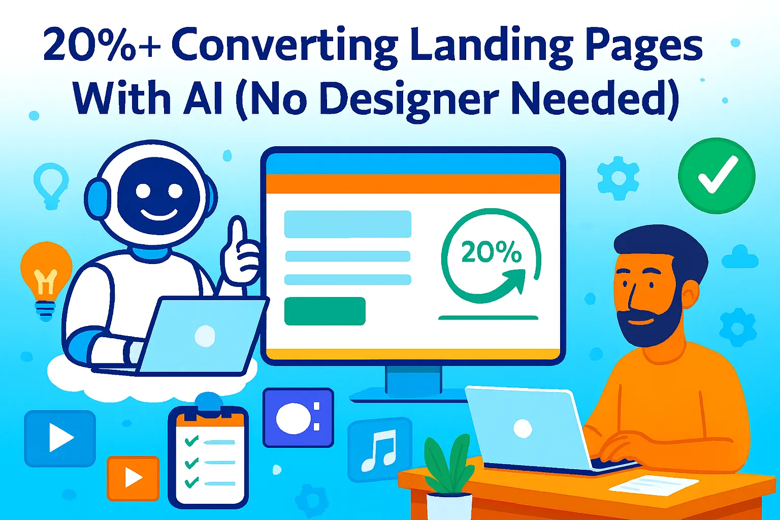
You're spending $500/month on ads. Traffic is coming. But your landing page converts at 2%.
That means 98 out of 100 visitors look at your offer and leave. You're burning money sending people to a page that doesn't work.
Here's the brutal truth: most landing pages fail because they're either overdesigned (trying to look "professional" instead of converting) or underwritten (no one knows what you're selling or why they should care).
The average landing page converts at 2-6%. Top performers hit 10-20%+. The difference isn't a $5,000 designer or a $2,000/page copywriter. It's knowing exactly what to say, where to say it, and how to remove every friction point between "I'm interested" and "I'm clicking your CTA."
This guide shows you how to use AI to write every section of a high-converting landing page — headlines that stop scrolling, bullet points that sell benefits, CTAs that drive action, and trust elements that remove doubt. All without touching Photoshop or hiring a copywriter.
Why Most Landing Pages Convert Like Garbage
Before we get into the AI system, let's talk about why your landing page probably sucks.
The median landing page conversion rate is 6.6%. That means half of all landing pages convert worse than that. And if you're a solo founder with no marketing background, you're probably in the bottom half.
Why landing pages fail:
1. Weak headlines Your headline doesn't tell visitors what you do or why they should care. It's clever instead of clear. Visitors bounce in 3 seconds.
2. Feature-focused copy You list what your product does instead of what problems it solves. Visitors don't care about features. They care about outcomes.
3. Too many CTAs You give visitors 5 options: "Start free trial," "Book a demo," "Watch video," "Read case study," "Download whitepaper." More choices = more confusion = no conversions.
4. Zero trust signals No testimonials, no logos, no proof. Visitors assume you're selling snake oil and leave.
5. Mobile disaster Your form looks fine on desktop. On mobile it's a nightmare. 60% of traffic is mobile. 60% of your visitors can't convert.
6. Slow loading Your page takes 5 seconds to load. 53% of mobile users abandon pages that take longer than 3 seconds.
The good news? AI can fix all of this. You don't need design skills. You don't need to understand psychology. You need the right prompts and a system.
The 20%+ Conversion Landing Page Framework
Here's what high-converting landing pages have in common (and how AI builds each section).
Component 1: Hero Section (Headline + Subheadline)
Your headline is the most important 10 words on your page. It determines whether visitors stay or bounce.
What makes a converting headline:
States the outcome, not the feature
Includes a timeframe or number
Speaks to a specific pain point
Under 12 words
AI Prompt for Headlines:
Act as a direct response copywriter. Create 5 landing page headlines for my product.

Product: [Your product name]
What it does: [One sentence description]
Target audience: [Who it's for]
Main problem solved: [The pain point]
Key benefit: [The transformation]

Requirements:
- Use the Problem-Agitation-Solution framework
- Include a timeframe or number
- Headline must be under 12 words
- Sub-headline must be under 25 words and expand on "how"
- Use active voice, no passive language
- Avoid clickbait or false claims

Format as:
1. Headline: [text]
   Sub-headline: [text]
2. Headline: [text]
   Sub-headline: [text]
etc.
Example Output:
Headline: Build Your SaaS Landing Page in 2 Hours, Not 2 Weeks Sub-headline: AI-powered templates convert 20%+ without designers or developers
Headline: Turn 2% Conversions Into 15% With AI-Optimized Copy Sub-headline: Solo founders use our prompts to write landing pages that actually convert
Headline: Stop Burning Ad Spend on Pages That Don't Convert Sub-headline: Get proven landing page copy in 60 minutes using AI prompts tested on 10,000+ pages
Pick the headline that:
Speaks most directly to your audience's pain
Has the clearest benefit
Doesn't feel too "marketing-y"
Test 2-3 variations with real traffic. The one with the lowest bounce rate wins.
Component 2: Problem-Solution Section
After your headline hooks them, you need to agitate the problem they're facing.
Structure:
State the problem (2 sentences)
Make it worse (show consequences)
Present your solution (how you fix it)
AI Prompt for Problem-Solution:
Write a Problem-Solution section for my landing page.

Product: [Your product]
Target audience: [Who it's for]
Main problem: [The pain point they face]
Consequences of not solving it: [What happens if they don't fix this]
Your solution: [How your product solves it]

Format:
- Problem paragraph (3-4 sentences that describe the pain)
- Agitation paragraph (2-3 sentences showing consequences)
- Solution paragraph (3-4 sentences explaining how you fix it)

Tone: Direct, empathetic, founder-to-founder
Length: 250-300 words total
No bullet points. Paragraphs only.
Example Output:
You're spending $2,000/month on Google Ads, driving traffic to a landing page that converts at 2%. That means 98 out of 100 people look at your offer and leave. You know the traffic is qualified — they clicked your ad — but something on your page isn't working.
The longer this continues, the more money you waste. Your cost per acquisition climbs. Your competitors with better landing pages steal customers you could've won. And you're stuck choosing between hiring a $2,000 copywriter or guessing what to change.
That's where [Product] comes in. We give you proven AI prompts that write every section of your landing page — headlines, benefits, CTAs, and trust elements. You plug in your product details, AI generates high-converting copy in 30 minutes, and you deploy pages that convert 3-5x better than what you have now. No copywriter. No designer. Just results.
Component 3: Benefit Bullets (Not Features)
Visitors don't care that your product "has AI-powered analytics." They care that it "shows which customers are about to churn so you can save them."
Benefits > Features.
AI Prompt for Benefit Bullets:
Convert my product features into benefit-driven bullet points for a landing page.

Product features:
1. [Feature 1]
2. [Feature 2]
3. [Feature 3]
4. [Feature 4]
5. [Feature 5]

For each feature, write:
- A benefit headline (6-8 words, starts with a verb)
- A benefit description (1-2 sentences explaining the outcome, not the feature)

Format as:
✓ [Benefit Headline]
  [Description of outcome/result]

Requirements:
- Focus on outcomes, not capabilities
- Use "so you can..." framing
- Include timeframes where relevant (e.g., "in 10 minutes" or "by next week")
- Avoid jargon or technical terms

Generate 5 benefit bullets.
Example Output:
✓ Find Your Best-Converting Copy in 10 Minutes Stop guessing what headline works. AI scores 10 variations and tells you which one has the highest conversion probability based on 50,000+ tested landing pages.
✓ Cut Your Cost Per Acquisition by 40%+ When your landing page converts 3x better, your ad spend goes 3x further. Same traffic, same budget, triple the leads.
✓ Launch New Pages in 1 Hour, Not 1 Week No waiting on designers or copywriters. Generate, edit, and publish landing pages the same day you need them.
✓ A/B Test 5 Variations Simultaneously Most tools force you to test 2 versions. We let you test 5 headlines, 3 CTAs, and 2 layouts at once — finding winners 10x faster.
✓ Track What Actually Drives Conversions See which sections visitors read, which CTAs they ignore, and where they drop off. Fix what's broken, double down on what works.
Component 4: Social Proof Section
Visitors don't trust you yet. They need proof that real people got results.
Types of social proof that convert:
Customer testimonials (with name + photo)
Logos of companies using your product
Data points ("10,000+ users" or "4.8/5 from 2,500 reviews")
Case study snippets (before/after results)
AI Prompt for Testimonial Requests:
If you have customers but no testimonials yet, use this prompt:
Write an email asking my customers for a testimonial.

Context:
- Customer's name: [Name]
- What they use my product for: [Use case]
- Results I know they got: [Outcome if known]

Email should:
- Be short (under 100 words)
- Ask 3 specific questions they can answer in 2 sentences each
- Make it easy to respond (no huge time commitment)

Questions to ask:
1. What problem were you trying to solve?
2. How has [Product] helped?
3. What would you tell someone considering [Product]?

Tone: Casual, not salesy.
If you don't have testimonials yet:
Use these proof elements instead:
"Trusted by 500+ solo founders" (if true)
"Based on frameworks tested on 10,000+ landing pages"
"Built by [Your Name], ex-[Impressive Company] growth lead" (your credentials)
"Join 1,200+ founders in our community" (social proof of usage)
AI Prompt for Social Proof Copy:
Write a social proof section for my landing page.

Available proof:
- [Number] of customers/users
- [Number] of [metric achieved, e.g., "landing pages built"]
- [Key testimonial if you have one]
- [Logos of notable customers if you have them]

Format as:
- One headline that summarizes the proof (8-10 words)
- 2-3 data points or testimonials below it
- Keep it visual-friendly (meant to be paired with logos or faces)

Tone: Confident but not boastful.
Length: 100-150 words.
Example Output:
Trusted by 2,500+ Solo Founders Who Scaled Without Hiring
"We went from 2% to 18% conversion in 30 days using these prompts. I didn't change the design — just rewrote the copy." — Sarah Chen, Founder of Pipeline AI
10,000+ landing pages built • 4.8/5 from 1,200+ reviews • Featured in TechCrunch, Product Hunt #1
Component 5: Call-to-Action (CTA)
Your CTA is where conversions happen or die.
What makes a converting CTA:
Action verb ("Get," "Start," "Claim," "Build")
Benefit included ("Start Your Free Trial" not "Submit")
Low friction ("No credit card required")
Contrasting color (stands out from page)
Above the fold AND at the end
AI Prompt for CTA Copy:
Generate 5 CTA button options for my landing page.

Product: [Your product]
Conversion goal: [What you want them to do: trial, demo, purchase, download]
Main benefit: [What they get]

Requirements:
- Start with an action verb
- Include the benefit or outcome
- Under 5 words if possible (max 7 words)
- Add a supporting line under the button (10-15 words) that reduces friction

Format as:
Button text: [CTA]
Supporting text: [Friction reducer]

Example:
Button: Start Free Trial
Supporting text: No credit card required. Cancel anytime.
Example Output:
Button: Build Your First Page Supporting text: Free templates included. No designer needed.
Button: Get AI Prompts Now Supporting text: Start writing better copy in 10 minutes.
Button: Try Free for 14 Days Supporting text: No credit card. Cancel anytime.
Button: Claim Your Free Template Supporting text: 500+ founders used this to hit 15%+ conversion.
Button: Start Converting More Today Supporting text: Set up in under 30 minutes.
Pro tip: Don't use "Submit," "Sign Up," or "Learn More." These are weak. Use action verbs that tell visitors exactly what happens when they click.
Component 6: Mobile-First Forms
If your form doesn't work on mobile, 60% of your traffic can't convert.
Form design rules:
Maximum 3 fields for lead gen (name, email, optionally phone)
Maximum 5 fields for trials (name, email, password, company, optionally phone)
Maximum 7 fields for high-ticket (demos, consultations)
Every extra field reduces conversions by 5-10%
AI Prompt for Form Field Optimization:
I need to optimize my form for conversions.

Current form fields:
1. [Field 1]
2. [Field 2]
3. [Field 3]
4. [Field 4]
5. [Field 5]

Conversion goal: [Trial signup / Demo request / Lead magnet download]

Questions:
1. Which fields are unnecessary and should be removed?
2. Which fields should be marked optional vs required?
3. What placeholder text should each field have to reduce friction?
4. Should any fields be moved to a second step after conversion?

Provide recommendations to maximize conversions.
Example Output:
Fields to remove:
"Company size" (ask this later in onboarding, not before conversion)
"Phone number" (only required for demo requests, not trials)
Fields to keep (required):
Email
Password (if creating account)
Fields to make optional: 3. Company name (capture if they provide it, don't block conversion)
Placeholder text:
Email: "you@company.com"
Password: "Create a secure password"
Company (optional): "Your company name (optional)"
Post-conversion collection:
Move "Company size," "Role," and "Use case" to onboarding flow after they've signed up
Reducing fields from 5 to 2-3 typically increases conversions by 20-40%.
Component 7: Urgency & Scarcity Elements
Urgency creates action. Without it, visitors say "I'll come back later" (they won't).
Types of urgency:
Time-limited discount ("50% off ends Friday")
Limited spots ("Only 10 coaching slots available this month")
Seasonal trigger ("2026 Q1 pricing ends March 31")
Feature unlock ("Early adopters get lifetime Pro access")
AI Prompt for Urgency Copy:
Create urgency copy for my landing page CTA area.

Product: [Your product]
Offer: [What they're getting]
Urgency trigger: [Time limit / limited spots / seasonal / feature access]

Requirements:
- One headline (8-10 words) that creates urgency
- One supporting sentence (15-20 words) that explains why they should act now
- No fake scarcity (only use if the urgency is real)

Tone: Direct, not manipulative.
Example Output:
Headline: Lock in 2026 Pricing Before It Increases March 1
Supporting text: After Q1, annual plans go up 30%. Get lifetime access to current pricing by signing up this week.
Headline: Only 15 Founder Coaching Spots Left This Quarter
Supporting text: We cap coaching at 25 clients to maintain quality. 10 spots filled. Book your call before they're gone.
Important: Only use urgency if it's real. Fake countdown timers destroy trust.
The Complete Landing Page Structure (Summary)
Here's the order top-converting pages follow:
Hero Section (Headline + Sub-headline + CTA button)
Problem-Solution (Describe pain → Show consequences → Present solution)
Benefit Bullets (5-7 outcomes, not features)
Social Proof (Testimonials, logos, data points)
How It Works (3-step process, optional but helpful)
Objection Handling (FAQ or "Why [Product]?" section)
Final CTA (Repeat your main CTA with urgency)
Do NOT include:
Navigation menu (removes distractions)
Multiple CTAs competing for attention
Long company backstory (no one cares)
Feature comparison tables (move to separate page)
One goal. One action. Remove everything else.
A/B Testing Your Landing Page (Free Tools)
Building the page is 50%. Testing is the other 50%.
What to test:
Week 1: Headlines
Test 3 headline variations
Keep everything else the same
Pick the winner after 1,000+ visitors
Week 2: CTA copy
Test 3 CTA button variations
Winner becomes default
Week 3: Benefit section
Test feature-focused vs benefit-focused copy
Benefit-focused usually wins
Week 4: Form fields
Test 3 fields vs 5 fields
Fewer fields = higher conversion, but potentially lower lead quality
Free A/B Testing Tools:
Google Optimize (Free, but sunset in 2023 — use alternatives):
Use VWO Free (50 monthly visitors tested)
Use Microsoft Clarity (free heatmaps + session recordings)
Use Hotjar Free (35 daily sessions)
Manual A/B Testing (if no tool):
Week 1: Run version A
Week 2: Run version B
Compare conversion rates
Not perfect, but works for solo founders on $0 budget.
How to calculate statistical significance:
Use this free calculator: https://www.optimizely.com/sample-size-calculator/
Baseline conversion rate: [Your current %]
Minimum detectable effect: 20% (e.g., 5% to 6%)
Statistical significance: 95%
Result: How many visitors you need to test
Don't stop tests early. You need at least 100 conversions per variation to trust results.
Tools You Actually Need (Budget Breakdown)
Free Tier (works for most solo founders):
ChatGPT free or Claude free (all AI prompts)
Google Analytics (conversion tracking)
Microsoft Clarity (heatmaps, session recordings)
Carrd ($19/year for landing pages, cheapest option)
Total: $19/year or $1.58/month
Upgrade Tier ($30-50/month when making revenue):
ChatGPT Plus ($20/month) for faster responses
Unbounce ($90/month) or Leadpages ($49/month) for landing page builder
Total: $49-110/month
Pro Tier ($150+/month when scaling):
ChatGPT Plus ($20/month)
Unbounce Pro ($135/month) with A/B testing
Hotjar Plus ($39/month) for unlimited session recordings
Total: $194/month
Don't buy until: You've validated your offer converts at 5%+ using the free tier. Tools don't fix bad offers.
Common Mistakes Solo Founders Make
1. Over-designing before testing copy
Design doesn't fix bad copy. Test your message first with an ugly landing page. If it converts, then make it pretty.
2. Using generic AI output without editing
AI gives you 80% there. The other 20% is adding your voice, specific data, and proof. Raw AI copy sounds robotic.
3. Testing too many things at once
Don't change headline + CTA + form fields + design in one test. You won't know what caused the lift. Test one thing at a time.
4. Not tracking micro-conversions
Track scroll depth, CTA clicks, and form starts — not just final conversions. This shows where people drop off.
5. Giving up after one test
First test might fail. Second test might fail. Third test usually finds a winner. Keep iterating.
6. Building landing pages for every keyword
Start with one landing page for your core offer. Only create variations once you're converting 8%+.
Your Weekend Implementation Plan
Saturday Morning (2 hours):
☐ Run AI headline prompt (pick top 3)
☐ Run AI problem-solution prompt
☐ Run AI benefit bullets prompt
☐ Run AI CTA prompt
Saturday Afternoon (2 hours):
☐ Build landing page in Carrd or Unbounce
☐ Add copy from AI prompts
☐ Remove all navigation/distractions
☐ Add one CTA above fold, one at bottom
Sunday Morning (1 hour):
☐ Test page on mobile (fix form if broken)
☐ Run Google PageSpeed test (aim for under 3 seconds)
☐ Set up Google Analytics conversion tracking
☐ Set up Microsoft Clarity for heatmaps
Sunday Afternoon (1 hour):
☐ Send page to 5 people in your target audience
☐ Ask: "What's confusing?" and "Would you click the CTA?"
☐ Fix obvious issues based on feedback
☐ Launch
Week 2:
☐ Drive 100+ visitors (ads, email, LinkedIn)
☐ Check conversion rate after 100 visitors
☐ If under 5%, test new headline
☐ If 5-10%, test CTA variations
☐ If 10%+, scale traffic
Month 2:
☐ Run first A/B test (headline variations)
☐ Implement winner
☐ Run second A/B test (CTA variations)
☐ Continue iterating
When You've Outgrown This System
You'll know it's time to upgrade when:
You're driving 10,000+ monthly visitors and manual A/B testing isn't fast enough. Invest in Unbounce Pro or VWO for simultaneous multi-variant testing.
You need landing pages for 10+ products/variations. At this point, hire a copywriter to work from your AI prompts as templates.
Your conversion rate is stuck at 12-15% and small tweaks aren't moving the needle. Hire a CRO specialist for advanced optimization (eyetracking, user testing, multivariate tests).
You want to personalize landing pages by traffic source (Google Ads vs LinkedIn vs email). Tools like Mutiny ($1,000+/month) handle dynamic personalization.
But honestly? Most solo founders never need this. The free AI system + basic A/B testing gets you to 10-15% conversion. That's enough to build a profitable business.
The Real Talk on Landing Pages
Look, building a landing page that converts 20%+ isn't magic. It's not some secret framework. It's just:
Clear headline that states the outcome
Benefit-focused copy that shows what they get, not what you do
Social proof that removes doubt
Friction-free forms that work on mobile
Strong CTA that tells them exactly what to do
A/B testing to find what resonates
AI doesn't replace good judgment. But it eliminates the blank page problem. It gives you proven frameworks, tested psychology, and high-probability copy in 30 minutes.
The hard part isn't generating the copy. It's testing it. Most solo founders build one landing page, drive 50 visitors, see 1 conversion (2%), and give up.
Don't be that founder.
Drive 500 visitors. If you're under 5%, test a new headline. If you're 5-8%, test CTA variations. If you're 8%+, scale traffic and keep iterating.
Every 1% increase in conversion rate makes your ads 1% more profitable. A page that converts 15% vs 5% means you can outbid competitors 3x and still be profitable.
Start this weekend. Pick one product. Write one landing page. Test it with real traffic.
You'll have your first 10%+ converting page within 60 days.
That's it.


Comments (0)
Leave a Comment